We use cookies to ensure we give you the best experience on our website. By clicking Agree you accept our Privacy and Cookies Policy.
Healthcare app design: how to create a great user experience

 19 minutes read
Content
In the healthcare sector, the software is used for different purposes, including managing patient records, appointment scheduling, laboratory diagnostics, and more. But what makes an excellent medical app?
You’ve guessed this right – it’s usability. Best healthcare apps take into account users’ needs and provide clear instructions on how to complete tasks within the system.
But how do you achieve great usability of healthcare UI? Continue reading, and you’ll learn first-hand insights about healthcare app design from our experts.
How medical app UI design impacts the quality of care
An interface is a bridge between users and a system. An intuitive and well-designed medical app UI can make the difference for better coordination of care and improved patient outcomes. In addition, it amplifies patient satisfaction levels and staff productivity levels: both are important in the overall success of healthcare organizations.
On the flip side, a poor-designed healthcare apps interface results in loss of profit, loss of time, or even loss of patient lives. That’s why you shouldn’t underrate the value of medical app design.
An effective UI is just one part of creating a safe and functional health care app. Other important concerns include data security, privacy protection, clinical accuracy, and interoperability. When all of these factors are taken into consideration during development, the solution best serves the interests of patients and healthcare providers alike.
By the way, take a look at our previous articles on healthcare app development:
- How to develop medical apps for doctors
- Everything you need to know about EHR systems
- The role of software as a medical device in healthcare
You will find loads of practical information about how to develop a health app that is accurate, secure, and up with regulations.


Ready to transform your healthcare application?
Start building a truly impactful digital health solution with us!
Core principles of effective healthcare app UX/UI design
Beyond the foundational design process, adhering to specific UX/UI principles is paramount for healthcare applications. These principles ensure that digital health tools are not merely functional but are truly supportive of patient well-being and clinical efficiency.
- Simplicity and clarity: Healthcare information can be inherently complex. Design interfaces that are minimalist, intuitive, and devoid of unnecessary clutter. Prioritize essential features, employ clear iconography, and use concise, unambiguous language to minimize cognitive load for users under stress.
- Accessibility and inclusivity: Healthcare apps must serve a diverse user base, including elderly patients, individuals with disabilities, and those with varying technological literacy. Implement features such as customizable text sizes, high-contrast color schemes, voice command integration, and screen reader compatibility. Ensure interactive elements are adequately sized and spaced for easy touch interaction.
- Empathy and emotional intelligence: Design should reflect an understanding of the patient’s emotional state, which can range from anxiety to relief. Utilize empathetic microcopy, reassuring feedback for actions, and a calming visual aesthetic (e.g., soft color palettes). The interface should foster trust and provide a sense of control and support.
- Data security and privacy by design: Given the sensitive nature of health information, security and privacy must be integrated from the initial design phase. This includes transparent data usage explanations, explicit consent mechanisms, secure login methods (e.g., biometric authentication, multi-factor authentication), and clear visual cues indicating protected content or data encryption.
- Consistency and predictability: Maintain consistent design patterns, navigation structures, and terminology throughout the application. Predictable interactions reduce the learning curve and allow users to focus on their health tasks rather than deciphering the interface.
- Efficiency and actionability: Healthcare apps often support critical tasks. Design workflows that are streamlined, minimize steps, and enable users to complete objectives quickly. Provide clear calls to action and direct access to essential functions like appointment scheduling or emergency contacts.
- Feedback and guidance: Provide immediate and clear feedback for all user actions, such as loading indicators, success confirmations, or error messages. Guide users through complex processes with clear instructions and intuitive prompts, preventing frustration and potential missteps.

Healthcare app design process step-by-step
The medical app design process is the process of creating a blueprint for your future healthcare app. It involves specifying the functionality, structure, and behavior of the system.
Although best practices in healthcare app UI design and healthcare UX design suggest a certain sequence of steps, remember: this sequence can be tweaked according to your product needs. You can even skip a step if it doesn’t make sense to you. But make sure you consult and get the green light from an interface design expert.
Important note: Expect ongoing communication with designers, developers, and project managers along the design process. The trick here is to articulate your expectations and requirements for a product clearly. At Blackthorn Vision, we keep our customers in the loop of the design process and involve them in decision-making as much as they want to. Now, let’s dig a little deeper into the process of healthcare app design.
Research and analysis
The first stage of any good UX/UI design process is research — and lots of it! This step involves taking some time to learn about your audience: their needs, wants, and pain points. Besides, user research gives us insights about competitor products: what works well for them, where they fall short? With all this data at hand, we can start mapping out our own mHealth solution.
Wireframing
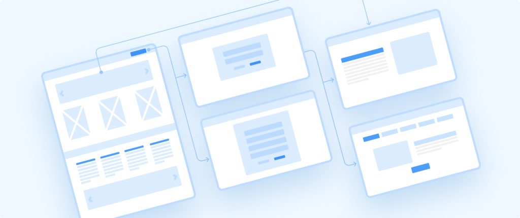
The next step is wireframing – constructing skeletal screen layouts that represent key screens within your app or website. This part lets us figure out software architecture and start to put together visual elements like buttons & icons, and see how it works in pairs. Bear in mind that at this point, functionality takes precedence over aesthetics – so don’t expect things to look perfect just yet!
Drafting medical app designs
Now we need to craft our medical app UI in more detail. We design app color schemes using the medical color palette: color-coding helps users quickly identify different types of information on a screen. And don’t forget UX writing: input fields should be clearly labeled so that users know what kind of information is required in each case.
Building interactive prototypes
Once wireframes and drafts are complete, we move on to prototypes. A prototype simulates actual app behavior & interactions giving us our first taste of how everything will come together once completed. Plus, it helps us test out aspects of healthcare app design before committing to anything too specific or finalized.
All-over testing
We start getting into more critical stages of development where real people put our design through its pace via usability testing sessions. By seeing how users interact with a prototype version of our medical health app, we can make changes before moving forward with development. This way, we can identify potential issues early on & fix them before they cause problems for real-world users.
Getting feedback
It’s time to get feedback directly from those who will be using it day in & day out! Not only does this give us valuable insights into what’s working well and what needs improvement, but hearing first-hand accounts from those who benefit most from our product is truly priceless.
Delivering code-ready design
After iterations of crafting and testing, we come to the final version of the healthcare app UI design. Preparing design for development should be a problem if you’ve already created a design system. We also organize components into a neat component flow diagram: it will help us structure your app and find things more easily later in development.
Challenges in medical app design and how to overcome them
As the world of healthcare becomes more complex, so do the challenges for UI/UX designers tasked with creating intuitive medical applications. Inevitably, many issues in app design go unaddressed.
Here are six common causes of usability problems:
- Lack of references
- Complicated A/B testing
- Putting functionality first
- Preventing errors
- Unconventional workflow scenarios
- Interface changes
Let’s take a closer look at each of them.
Lack of references
Finding good references can be challenging when you create interfaces for a medical health app. After all, many healthcare facilities use proprietary systems that are not available to ordinary users. Plus, they tend to follow specific guidelines and requirements that don’t align with your business needs. However, some general tips can help you get started on your search for the perfect healthcare UI.
Since you can’t look for inspiration in other healthcare apps on the market, your design team must have a solid track record in healthcare app development. Using their background as a reference source, designers already know what works well in terms of user experience and interface design.
Another critical step in crafting healthcare app UI design is working closely with medical professionals during the development process. This way, you can ensure that your app meets all necessary clinical requirements while still providing a superb user experience in healthcare.
Complicated A/B testing
A/B testing is essential for any organization engaged in custom healthcare app development. It allows designers to test interface changes on small groups of users before rolling them out to the entire population. In the aftermath, A/B testing can help improve usability, engagement, conversions, and other pivotal metrics.
However, it can be difficult to design an interface for hardware that is still in development as you cannot adequately try out your hypotheses. What’s more, designers face challenges identifying factors that will have the biggest impact on users. So, they must brainstorm and ramp up their creativity to bring the testing environment as close to the real world as possible.

Our experience:
While developing laboratory software, our team experimented with testing settings and techniques. We started with in-person A/B testing on the client’s premises involving our potential users – laboratory technicians. After the global pandemic breakthrough, we moved to a virtual testing environment. Using the Maze product research platform, designers tested all aspects of healthcare UI and healthcare UX design, from icons and layout to user flow and functionality.
Putting functionality first
When dealing with people’s health and safety, you must double-check that everything works as intended. There’s no room for error with something as crucial as healthcare. Thus, any time spent on making things look nice is time that could be spent on making everything work correctly.
Of course, this doesn’t mean that aesthetics should be wholly ignored in medical app design. On the contrary, aesthetics do play a role in healthcare user experience and engagement: both are significant factors in whether someone will use a piece of software. Still, when push comes to shove, the functionality must always take priority over the looks.
Our experience:
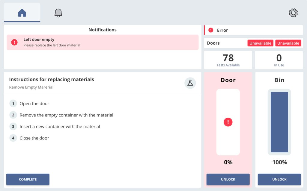
When creating an interface for laboratory software, we focused on three fundamental objectives:
- Speed and quality of lab tests
- User environment settings
- Wearable equipment that might disrupt the app’s usability
For example, lab technicians use applications in gloves. Designers should keep it in mind while constructing action buttons and other interactive elements. A well-designed healthcare apps interface reflects all functional nuances and addresses them accordingly.
As for the aesthetical part, we strike the right balance – keep it simple but up-to-date; not overcrowded with visual noize while providing as much functionality on a single page as needed.
Preventing errors
When it comes to creating apps for healthcare, clarity is key. Users should be able to quickly find the information they need without accidentally clicking on the wrong thing. That’s why it’s essential to concentrate your efforts on anticipating and preventing possible errors throughout your medical app design.
Here are several ways to eliminate errors in user flow:
- Use large buttons and iconsThis will reduce the chances of users making accidental clicks or mistakes, especially those wearing special medical equipment.
- Make sure your interface is intuitiveYour app’s interface should be easy-to-use and self-explanatory. Label all functions and features clearly so that users know what to click on before taking action.
- Increase the number of confirmation dialogsConfirmation dialogs are generally considered annoying because they interrupt the flow of what users are trying to do. However, when used sparingly and for a good reason – like preventing accidental data loss – they can be quite helpful. In laboratory software, users often have only one attempt to perform an action, so confirmation dialogs are the safest way to ensure no data is left behind.
- Use notifications sparinglyToo many notifications can overwhelm users, leading them astray from completing their intended task within your medical health app. So only send out alerts when absolutely necessary – such as in an emergency – and provide clear instructions on what actions need to be taken.

Unconventional workflow scenarios
One of the main goals for any designer is to create an interface that is easy to use and understand. But not every designer knows how to design a healthcare app properly with all the complexities involved in healthcare data and workflow processes.
Our experience:
While developing an interface for laboratory hardware, we stumbled upon a problem. Unlike healthcare web apps, medical device interfaces are based on specific engines and components with uncommon workflow scenarios. For this reason, designers couldn’t apply the same practices they normally used and approached this challenge as scientists.
To understand what our users need, we performed exhaustive user research and analyzed medical business processes. This gave us an idea about how to implement necessary features in a user interface. Then, using the trial-and-error method, we tested out various designs to find an optimal solution.
Interface changes
Changes in software interfaces are a major source of user dissatisfaction, particularly in healthcare applications. Even minor interface updates can trigger a decline in performance and extend time-to-delivery. It’s critical for clinical diagnostics, as laboratories cannot afford to retrain employees every time they make an interface update.
There are several steps that developers and designers can take to prevent or mitigate this issue:
- Engage with users early and often during the design process. It will ensure that changes reflect actual user needs and preferences.
- Make sure any changes are introduced gradually, allowing users time to adjust. Sudden, sweeping changes are more likely to cause confusion and frustration.
- Provide clear documentation and training materials for any new features or interface elements. Users should never feel like they’re struggling to figure out how to use health care apps on their own.
- Be prepared to listen to feedback and make adjustments after rollout. No matter how much effort is put into planning, there’s always an ongoing risk that something won’t work as intended once it’s live. Being open to making tweaks based on user feedback can help reduce negative reactions overall.
Before:
After:
Our experience:
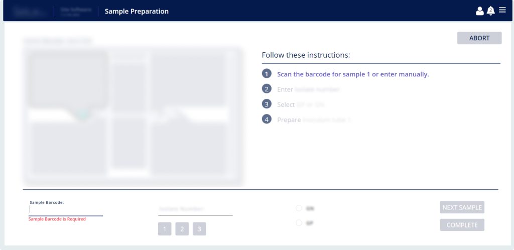
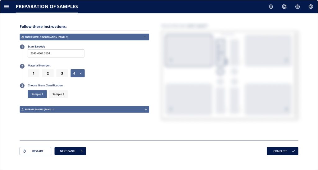
Updating a medical app UI involved multiple iterations of detection and analysis of performance bottlenecks and the following optimization. With every change being made to our laboratory diagnostics software, we aimed to keep the learnability high so that our users can easily navigate the app. The updates we made included:
- Revamping the sample analyzer interface. This module assists lab techs in performing various tasks, such as reagent pack removal, waste bag replacement, etc.
- Reorganizing errors and adding illustrated guides to the troubleshooting section that previously had only text instructions. As a result, we distributed 100+ errors into 17 groups based on the hardware part that needs to be fixed.
- Optimizing user flow of the sample preparation interface to make it more straightforward and efficient.
- Improving the login page UI for smoother and error-free performance.
However, even minor modifications have the potential to cause disruptions for users. Therefore, any time an update is planned, developers and stakeholders should evaluate its potential impact on users and take steps to minimize adverse reactions.
Ensuring Data Security and Privacy in Design
The sensitive nature of personal health information (PHI) necessitates that data security and privacy are fundamental considerations, not merely an afterthought, in healthcare app design. UX/UI elements play a critical role in communicating and enforcing these protections, ensuring compliance with regulations such as HIPAA (Health Insurance Portability and Accountability Act) in the U.S. and GDPR (General Data Protection Regulation) in Europe.
- Transparent Data Handling: Clearly communicate to users what data is collected, how it is used, and with whom it might be shared. Implement easily accessible privacy policies and terms of service within the application.
- Granular Consent Mechanisms: Provide users with clear, actionable options to control their data sharing preferences. Instead of broad agreements, design interfaces that allow granular consent for specific data types or purposes. Use confirmation dialogs for sensitive actions, ensuring informed user decisions.
- Secure Authentication Flows: Implement robust, yet user-friendly, authentication methods. This includes support for multi-factor authentication (MFA) and biometric login (e.g., fingerprint, facial recognition) to enhance security without introducing significant friction. Design secure password recovery processes that protect user accounts.
- Visual Cues for Data Protection: Incorporate subtle visual indicators that reassure users about data security. This could include padlock icons next to secure input fields, encryption indicators, or visual confirmation when sensitive information is successfully saved or transmitted.
- Error Prevention in Data Entry: Design input fields and forms to minimize data entry errors, which can have significant implications in healthcare. Implement input masks, real-time validation, and clear error messages. For critical data, consider confirmation steps before final submission.
- Compliance Integration: Ensure design choices inherently support regulatory compliance. For instance, in-app messaging features must be secure and encrypted to comply with PHI communication standards. Data retention policies should be reflected in how historical data is presented and managed within the UI.
Integrating modern technologies and trends in healthcare UX
The healthcare technology landscape is rapidly evolving, with new innovations significantly impacting UX design. Incorporating these modern technologies can enhance app functionality, improve patient engagement, and streamline clinical workflows.
- Artificial Intelligence (AI) and Machine Learning (ML):
- AI-Powered Chatbots: Design intuitive chatbot interfaces for instant patient support, FAQs, appointment scheduling, and basic symptom assessment. These chatbots can offer personalized interactions and automate secure data handling, freeing up human resources.
- Predictive Analytics in UX: Utilize AI to offer personalized recommendations (e.g., medication adherence reminders based on past behavior, preventative health suggestions) and adapt the UI dynamically based on user patterns or health status, creating a proactive user experience.
- Human-AI Collaboration: For clinicians, design interfaces that effectively integrate AI insights into diagnostic and treatment planning. This includes clear visualization of AI-generated data, confidence scores for AI predictions, and explainable AI (XAI) features that show the reasoning behind AI suggestions, fostering trust and efficient decision-making.
- Telemedicine and Remote Patient Monitoring (RPM):
- Seamless Video Consultation Interfaces: Design robust, easy-to-use video and audio communication features, ensuring stability even on lower bandwidths. Include clear call-to-action buttons for starting/ending calls, sharing screens, and accessing chat functionalities during consultations.
- Integrated RPM Dashboards: For apps connected to wearables or IoT devices, design clear, digestible dashboards for patients and providers to monitor vital signs, activity levels, and other health metrics in real-time. Emphasize visual trends and alerts for deviations.
- Voice User Interfaces (VUIs): Implement voice commands for navigation and data input, particularly beneficial for users with limited mobility, visual impairments, or for hands-free clinical environments. Design clear voice prompts and consistent feedback for voice interactions.
- Digital Therapeutics (DTx): For DTx apps, which deliver evidence-based therapeutic interventions, the UX must be highly engaging and consistent. Incorporate elements like progress tracking, gamification, and personalized content delivery to support long-term adherence and behavioral change.
- Augmented Reality (AR) and Virtual Reality (VR): While still emerging, consider the potential of AR/VR for immersive patient education, surgical planning visualization, or therapeutic experiences (e.g., pain management through VR). Design for intuitive spatial interactions and minimal motion sickness.
The business impact of superior healthcare UX
While often discussed in terms of user satisfaction and clinical effectiveness, superior healthcare UX design delivers significant business advantages. Investing in a well-crafted user experience directly contributes to an organization’s bottom line and strategic objectives.
- Enhanced Patient Engagement and Adherence: Intuitive and supportive apps encourage consistent use, leading to better patient engagement with their health management plans, higher adherence to medication regimens, and improved lifestyle choices. This proactive involvement often results in better health outcomes.
- Increased Patient Loyalty and Retention: A positive user experience fosters trust and satisfaction, making patients more likely to continue using the app and, by extension, the healthcare provider’s services. This reduces churn and strengthens the patient-provider relationship.
- Improved Operational Efficiency and Cost Reduction: Well-designed apps can automate routine tasks such as appointment scheduling, prescription refills, and information retrieval. This reduces the administrative burden on staff, minimizes errors, and frees up healthcare professionals to focus on direct patient care, leading to significant operational cost savings.
- Reduced Training and Support Costs: An intuitive interface requires less user training and generates fewer support inquiries. This lowers overhead costs associated with technical support and onboarding for both patients and healthcare staff.
- Stronger Brand Reputation and Competitive Advantage: In a competitive digital health market, a highly usable and delightful app differentiates a provider, enhancing its reputation as innovative and patient-centric. This can attract new patients and partners, providing a distinct competitive edge.
- Data-Driven Insights for Better Care: Apps designed with robust analytics and feedback mechanisms enable the collection of valuable user interaction data. This data can inform continuous product improvement, identify areas for service enhancement, and ultimately contribute to more personalized and effective care delivery.


Ready to design a healthcare app?
Developing user-centered healthcare applications and encouraging real patient engagement
Software development for healthcare app
If you’re questioning how to create a health app, you’ve come to the right place. At Blackthorn Vision, we have a team of skilled designers and developers who can create custom healthcare apps for your organization. Our healthcare app development services include:
- Healthcare web app development
- Healthcare mobile app development
- Healthcare app UI design
- Cloud-based development
- Big data analytics and machine learning
Our team has expertise in building all types of healthcare apps, including those for clinical diagnostics, appointment management, patient tracking, electronic health records (EHR), and much more. We understand the unique challenges that come with developing healthcare applications and are committed to delivering high-quality solutions that meet your specific needs.
If you’re interested in learning more about our healthcare software development services or getting started on a project, contact us today!


