

Integrating ChatGPT into your mobile UX design process can help you save time while improving the customer experience. It can automate repetitive tasks, enhance data collection, and handle many interactions.
Mobile app UX design: Basics that will improve user experience

 15 minutes read
Content
Creating a mobile app is a new level and the next step for your business. But would you like it to be a step backward? 52% say a bad mobile experience makes them lose faith in a company. Not in an app but in a company.
Therefore, consider investing time and costs into the mobile app UX design strategy and be familiar with its specifics and trends — those things we cover in this article.
What is mobile app UX design?
Citing The Interaction Design Foundation, Mobile UX designs are interfaces for hand-held and wearable devices. Accordingly, mobile UX designers work on creating positive experiences for mobile device users.
Mobile users have been an online majority since 2014. That’s when thousands of challenges and opportunities appeared. UX designers and strategists realized it’s not an option just to shrink a web app to make it mobile-size. You need to optimize it, relying on research and keeping in mind some vital specifics.
Why you should be thinking about mobile app UX
People use the same apps differently on a desktop and mobile — the most straightforward example is Google Maps. We have relatively long seances on a desktop while planning a trip or building a hiking route. But we spend minutes or even seconds in a mobile app, trying to get the direction, figure out the traffic or send someone our location.
The same we can say about most apps. The general purpose of the app stays the same, but small goals, interactions, and expectations are different. Understanding these differences is the starting point in your work on mobile UX design.
How people hold mobile devices
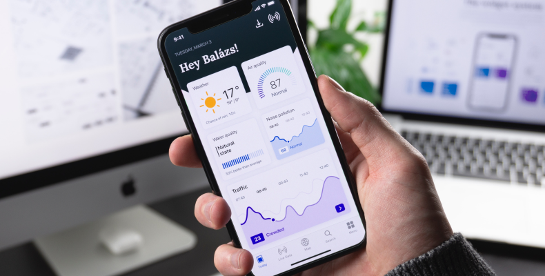
To create a user-centric design, consider how people use their mobile devices. Usually, they hold them in one hand, often — in crowded places like restaurants, public transport, and queues. These are the situations for mobile apps to blossom — when people need to fill their time. What would they expect? They’d expect a fast-loading app they can use with one hand while holding the phone vertically. They want to push the buttons, scroll, or type with one finger. And they don’t wish to have personal information on their screens for long.
Differences between desktop vs mobile UX
Let’s take a closer look at these differences between desktop and mobile UX. They are the first direction indicator in the mobile app UX design.
Workspace
While using a desktop app, we usually have many windows open and switch from one to another quickly. We even have multiple desktops, physical and virtual. We also have a complete package of tools like a full-size keyboard, a mouse or a touchscreen, notepads, pens, or a Note app open.
While using a mobile app, we usually have only a phone. It takes work to switch from one app or page to another, for example, to write something down or transmit data. Often, we focus on a simple task while being occupied with something else.
Multitasking on a desktop looks like operating many windows and making prolonged interactions. Multitasking on mobile looks more like choosing a playlist, scrolling a news feed or saving a day streak in Duolingo while grabbing coffee or commuting.
Display orientation
While using a desktop app, we operate a big screen, can analyze a lot of information, and take actions like screen zoom, dividing the text, and scrolling. Mobile screens are much smaller, and these operations might be more complicated. It’s critical to position the essential buttons and call to action where they get the most attention.
Another huge difference is that mobile phones people mainly use vertically, while desktop displays are horizontal. You have to consider this while deciding on functionality to include in your mobile app, how to introduce the information, and while locating buttons.
Visual language
On a desktop, we can proceed with more details and explanations. On mobile, we rely on patterns, visual clues, and intuition. First, we use mobile apps for quick tasks and want them to be simple. Second, reading text on buttons can be challenging because of being on the road or under bright sunlight or simply because of the small screen size.
Icons, pictures, arrows, and animation come in handy here. They create patterns and make current and the following sessions easier.
iOS vs. Android app UX
To make your app universal and reach the maximum of your audience, make it available for both Apple and Android users. Apple and Google care a lot about the app appearance in their app stores. They provide detailed documentation on app design which is open-source and available for any designer.
The set of iOS rules is called Human Interface Design. Android devices require following the Material Design Principles. Sticking to these guidelines makes the design process faster and error-free regarding mobile UI design consistency. The development stage becomes less time and cost consuming. And most importantly, users get a familiar and easy-to-understand experience.
In mobile design, we respect a user’s task and mindset, as well as the device’s limitations.
JOSH CLARK, THE AUTHOR OF TAPWORTHY: DESIGNING GREAT IPHONE APPS
The main UX differences rely upon navigation. On Apple devices, you swipe to go back, while Android users tap a Back button in the navigation tab at the bottom of the screen. Android apps use a hamburger menu for switching apps, whereas iOS has a tab bar. The button design also differs, and the floating activity button locates differently.

The mobile app design process
The stages of designing mobile user experience might vary or be divided into smaller phases. Some of these phases might be repeatable. Here is the framework every mobile UX design agency can follow and succeed.
Step 1: Planning
First, the design team cooperates with the business analytics department and creates a plan for a process. They rely on the time estimate and focus on core requirements. Then — make decisions on functionality and divide responsibilities in the team.
Step 2: Research
Research helps designers to find the best solutions and stay up-to-date in case of trends and competition. With the results of this research, designers can organize brainstorming sessions, come up with ideas, and get inspiration and a direction for following creative processes.
Step 3: Specification
A design team works on specifications and presents them to the client. It is a description of all tools and methods the designers will use. They explain why they came to this or that decision and where it will lead. This specification moves to a development team when the design work is done.
Step 4: Wireframing
Wireframe might be called a skeleton of an app. It’s the basis for the future product and represents its vital functionality. This process is usually short but requires close team cooperation and a lot of discussions.
Step 5: Prototyping
The last step is creating a clickable prototype. It is the exact copy of the final product and allows the team and stakeholders to see how the user will interact with an app. The client gives feedback, asks all the questions, and, if needed, the design team makes changes according to new requirements.
The dos and don’ts of mobile app UX design
With an understanding of the process of creating UI/UX design for mobile apps, let’s move to some golden rules and not that obvious ones. Considering them helps to avoid mistakes, blind decisions, and extra spending.
The dos of mobile app design
Prioritizing user experience
While working on the UX, designers must keep end-users and their needs in mind. The design should be visually attractive, appealing, intuitive, and easy to navigate. Conduct UX research to understand your target audience, its needs, and its pains.
Constantly collect the feedback, analyze it, and improve your product, relying on it.
Building a solid visual hierarchy
Visual hierarchy is an arrangement of elements on the screen. It makes it easier for users to navigate an app and realize its value. To achieve a strong visual hierarchy, experiment with font size and contrast, use bold and italics and play with the placement.
Optimizing for all mobile devices
Mobile devices have different screen sizes and resolutions; your task is to create an app that looks and operates well in all of them. Make your design flexible and adaptable to displays of different sizes, including tablets. Use responsive design, which adjusts your app’s layout automatically.
Another task is to reduce loading time. You can achieve this by compressing images and reducing the number of HTTP requests.
The don’ts of mobile app design
Overcrowding the screen
By overcrowding a screen, you overwhelm a user. Use enough white space to make your app easy to understand and navigate. Don’t include much text on one screen; users might see it and quit immediately.
Inconsistent design elements
Establish a visual language for an app to avoid inconsistency. Create a style guide with a color palette, typology, buttons, and all the elements. The consistency rule also applies to swiping and scrolling.
Overloading users with notifications
Notifications are one of the most powerful functionalities. Yet, its inappropriate use can play an evil game. Messages must be relevant and timely and only include essential and correct essential information.
Best practices for mobile UX design
There are many practices for developing a UI/UX design for mobile and web apps. They modify and replace each other with a flow of time and change of trends. Here are some up-to-date and universal ones.
Use gestures
Gestures are the best way to make the user experience easy and intuitive. They make it easier to navigate on a small screen and build the pattern making people get used to the app faster. While considering them, keep in mind the following:
- Gestures must be intuitive and logical.
- Only include a few of them, and don’t overwhelm the user.
- Analyze feedback; sometimes, adding animation or changing an arrow is enough to make a difference.
The most used gestures are:
- tapping — for choosing an option and pushing a button
- finger movement — to scroll
- swiping — to move between the screens
- pinching — to zoom in and out
Think well about notifications
Notifications are vital to keep your users updated about the functionality and to remind them to open an app and to see what’s new. However, too many of them have the opposite effect. When working on your app design, decide well what you will notify your users about and when.
Consider giving them a right to choose notifications options in a Settings menu. Make notifications clear and concise. They have to provide value to users, not to annoy them.
Maintain consistency
Consistency is vital for making the user experience intuitive. They should understand where they are in the app and which actions are available. Maintain the same color scheme, iconography, and typography throughout the app. Place all UI elements like buttons and controls consistently as well.
If your app has numerous interfaces (Ex: for a student, for a teacher, for an admin), make it easy to understand, they are the parts of one app or a group of apps.
Use white space
White space (negative space, or breath space) is the name of the emptiness between the objects. Besides being a blank space, it is incredibly functional and might be a life changer.
White space helps to set accents on specific objects, divide them, or group them.
Generally, white space creates a feeling of harmony, structure, and order.
Simplify introduction
The first minutes after downloading an app, the user usually spends creating an account. The cost of mistakes is high here. Make the navigation from one field to another fast and quick. Otherwise, you risk losing their interest.
Ex: It might be urgent if it’s a taxi or delivery service. Long and complicated onboarding turns users away from your app and makes them opt for your competitor.
Consider requiring vital data at the beginning and allowing feeling the rest later. Use notifications to remind users about it.
Focus on content-centric design
Keep in mind that the design is not a product itself. It’s a package for a principal value. It means nothing if users can’t use it to reach the primary purpose.
Start the design process by creating a wireframe of your app’s layout, then work on text and images. This way, you ensure that the app is consistent and the content is easy to find and represented correctly.
Avoid UI noise
UI noise is a term that defines too much text and visual elements on the screen. Remember, they all fight for the user’s attention on the small mobile screen.
Minimalism has been a trend for the last few years, and there are reasons. By avoiding UI noise, mobile UI designer prioritizes elements and eases navigation. The best ways to do so are:
- Using fewer colors
- Using simple shapes
- Being careful with animation and typography
Consider a poor connection
If you want to be used by people in areas with unstable internet connections or travelers, there are some recommendations on how to reach that:
- Use small pictures, videos, and audio.
- Use caching to store data so it’s possible to access it offline
- Use data compression
- Include ‘download’ functionality if relevant
- Run the tests and collect feedback in these areas to make sure you do right
One hand-centered design
Make it possible to use your app while having one hand busy with something else — food, drink, or a handrail.
Place the most essential buttons within easy reach. Keep this in mind while considering your gestures and notifications. Make it possible to hide a notice easily if it covers content. If you have a complex app, use buttons and built-in links to navigate among the pages.

Mobile UX design constraints
The important thing about mobile app designing is that you can rarely make them work 100% perfectly. Even considering all the information mentioned above leaves space for constraints. They might be more or less acute, depending on the type of app.
Client-side storage
Three-fourths of all apps stay on the phone only for three days. There are different reasons to do so, but the most frequent one — people don’t have enough space on their phones.
The major constraint of mobile apps is that the data is stored client-side rather than server-side like on the web. With time, apps are becoming ‘heavier’ and more complex. They include 4k videos and live photos, and all this data needs to be stored. When the overload happens and the user gets a notification about it, they have to decide what to delete.
To handle this, product owners aim to make their apps hard to give up. It means making them a habit, a part of life. In the case of mobile, the frequency of use plays a more significant role than importance.
Ex: Uber is important, but you might use it sparingly. You can delete it now and install and log in within a minute when needed. A fitness app, mainly used every other day, has a good chance to stay, even while heavy.
Small screen sizes
The screens may get bigger over time, but they are still too small to complete some tasks comfortably. The keyboard is the major problem; it’s not easy to use even in full (horizontal) mode. It annoys the most during the login process.
To make it easier for a user, consider making the login process as short as possible, and eliminate friction.
Distractions
Users are more likely to drop a mobile app than a desktop one. Mobile devices are better for short interactions or filling time, while desktop ones we mainly use during work or research.
Develop a strategy for getting users back when they quit. You may develop a habit, give rewards, make a user a part of a community, challenge them, etc. Be careful with notifications, and don’t overuse them. Think of a suitable and persuasive UX copy.
Hard updates
Making a teeny-tiny change in a mobile app takes about seven days to get approved by Apple. After this, the user has to download an update because all the data is stored on their side; immediately fixing a bug is impossible.
To eliminate risks and the need for frequent updates, conduct a discovery process before development and run regular tests. Errors might still occur, but their amount will be much lower.
Conclusion
A UX design is like a joke — it’s not that good if you have to explain it. A great design combines beauty and functionality, which should be your goal while building an app. Focus on the main features, put yourself in the user’s shoes, rely on the research, and be relatively modest with visual elements.
Always keep in mind that the design is not a product itself. It’s the way to present it and make it as easy as possible to get the primary value.

How Blackthorn Vision can help with mobile app UX design
UI/UX design for mobile and web apps is one of our main specializations. We have a team of experienced designers and strategists able to work on your project from scratch or improve the existing one.
We run thorough UX research and rely on it along with clients’ demands and expectations, estimates, market analysis, and the latest trends. Our goal is to deliver an intuitive, simple, and eye-catching design.
If you need a proactive team to create the mobile UX design and enter a market with a competitive product, contact us, and we’ll have it done.
FAQ
ChatGPT and mobile app UX design?
How much does mobile app UI/UX design cost?
The average cost of a UI/UX design for mobile apps varies from $3000 to $30,000. The range depends on different factors, including the complexity of an app idea, the size and type of team and its location, time-frames, etc.
What is UI design in mobile?
A mobile UI is a graphical display on a mobile device that allows users to interact with the apps, features, content, and functions. Simply put, it’s what users see when they open an app.
You may also like
-
 June 30, 2026Read in 10 min.
Software development company in Boston: Custom solutions for a research-driven city
Boston software development company building HIPAA-aware healthcare, biotech, and enterprise software on .NET and Azure. Microsoft Solutions Partner, 4.8/5 on Clutch -
 June 18, 2026Read in 10 min.
Software Development Company in Washington State: Custom Solutions Across the Region
Software development company serving all of Washington State. Cloud-first custom software on .NET and Azure. Microsoft Solutions Partner since 2009. -
 June 17, 2026Read in 12 min.
Software Development Company in Seattle: Cloud-First Custom Solutions
Seattle software development company building cloud-first custom software on .NET and Azure. Microsoft Solutions Partner trusted since 2009. Talk to us -
 June 11, 2026Read in 22 min.
Top 10 SEO Companies in the USA: An Honest, Research-Backed Guide
We compared 40+ professional SEO agencies on verified reviews, case studies, pricing, and AI search expertise — and ranked the top 10 with honest pros and cons. -
 June 10, 2026Read in 22 min.
Selecting elite Vue.js development company
Top Vue.js development companies vetted for Vue 3 architecture, high-performance rendering, and secure AI integration. Read our definitive guide for tech leaders. -
 June 1, 2026Read in 21 min.
iOS App development companies: How to choose a partner that actually ships
Leading iOS app development companies serving the US market, with verified portfolios, real pricing ranges, and a framework to choose the right fit -
 May 28, 2026Read in 27 min.
Azure Consulting Services: Migrating and Optimizing on Microsoft’s Cloud
Azure consulting services explained: migration, data, AI, security, and cost optimization. Learn what they include, how engagements work, and how to choose the right partner -
 May 26, 2026Read in 13 min.
How to choose the right enterprise software development company
Scale your architecture. Partner with a premier custom enterprise software development company to untangle technical debt and build secure platforms. -
 May 22, 2026Read in 16 min.
Top 10 Web Development Companies: How to Choose the Right Partner
Move past generic rankings. Learn the exact framework to evaluate web development agencies based on tech stacks, compliance standards, and pricing models. -
 May 15, 2026Read in 18 min.
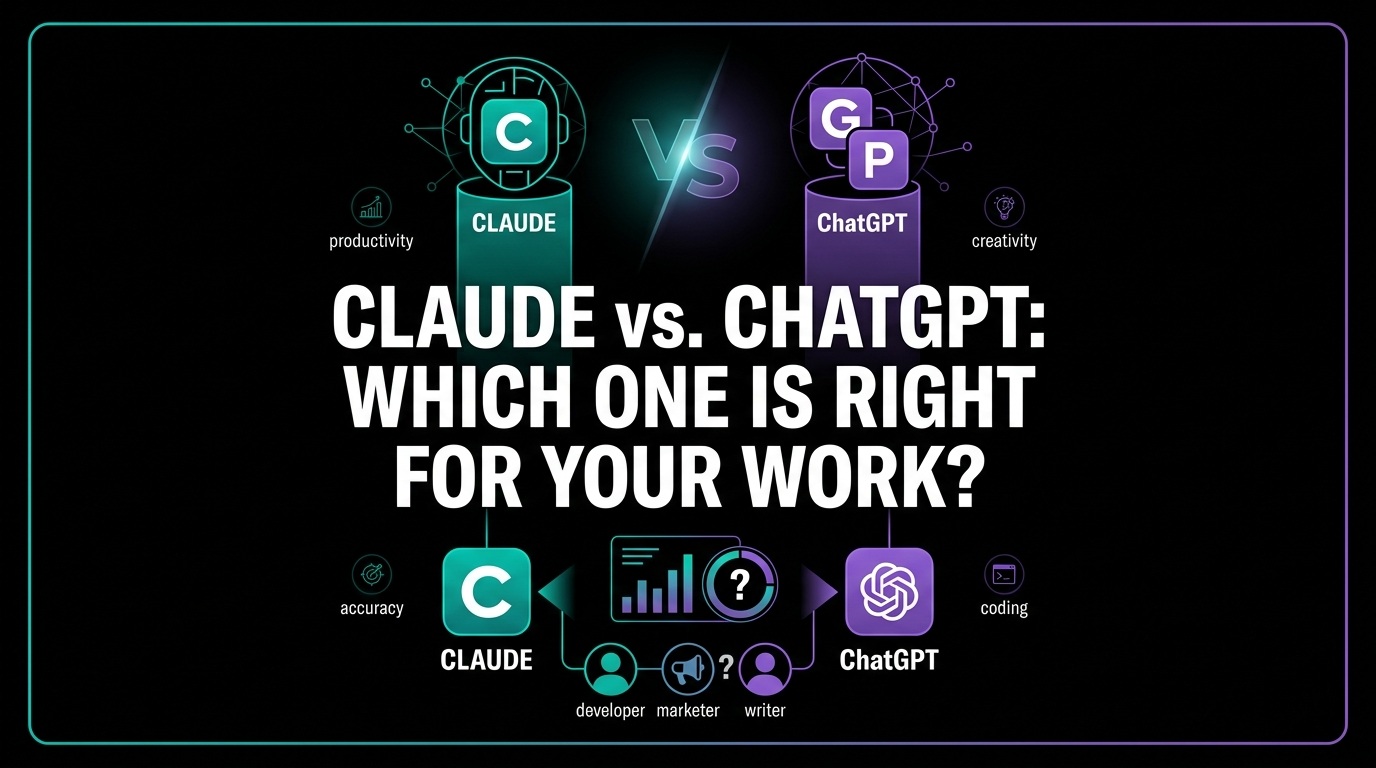
Claude vs. ChatGPT: Which one is right for your work?
Should you switch to Claude for its Artifacts or stay with ChatGPT for its Omni-Agent capabilities? A hands-on comparison of reasoning, coding, and privacy. -
 May 11, 2026Read in 13 min.
Top DevOps companies: Strategic partners for engineering excellence
Top DevOps service providers. From Platform Engineering to DORA metrics, we review the best partners to scale your infrastructure and developer velocity in the USA. -
 April 24, 2026Read in 21 min.
Top financial software development companies
Compare the best financial software development partners. We rank firms based on ISO 27001 certifications, regulatory expertise (PSD3, GDPR), and successful delivery of 500+ Financial projects. -
 April 23, 2026Read in 20 min.
Top 10 software product development companies for the USA
Scale your transformation with the world's most reliable product development partners. We rank the top 10 firms for security, FinOps, and enterprise-grade architecture. -
 April 16, 2026Read in 13 min.
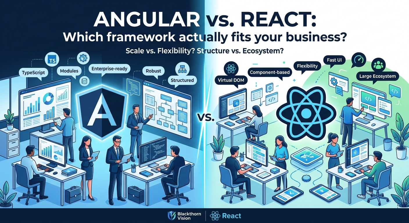
Angular vs. React: Which framework actually fits your business?
Compare React’s ecosystem flexibility vs. Angular’s opinionated platform. Learn which framework offers better ROI, talent availability, and long-term stability for your tech stack -
 April 15, 2026Read in 17 min.
Outsourcing IT companies: Driving ROI and innovation
Maximize ROI with the right outsourced IT solutions. Discover how leading IT outsourcing service providers are using AI and automation to accelerate digital transformation. -
 April 9, 2026Read in 24 min.
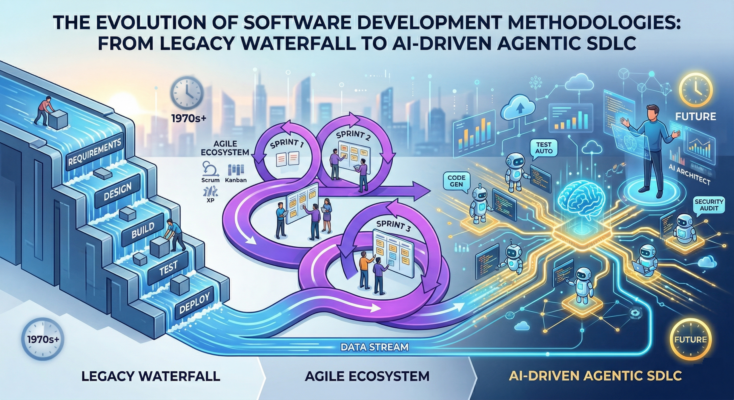
Software development methodologies: A complete guide from waterfall to AI-driven SDLC
Which methodology fits your project? Read our deep dive into Scrum, Kanban, Lean, and AI-powered development with a full comparison matrix -
 April 9, 2026Read in 10 min.
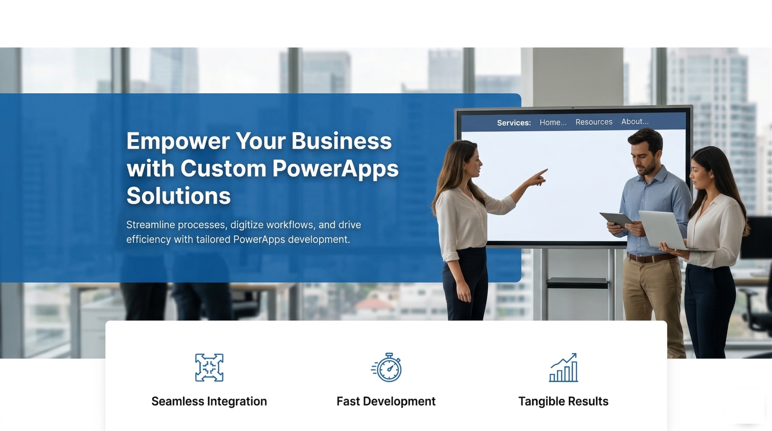
Microsoft PowerApps development services
Accelerate your digital transformation with expert PowerApps development services. We build custom, low-code mobile and web apps that integrate seamlessly with Microsoft 365, SQL, and your existing APIs. Get a free consultation today. -
 April 8, 2026Read in 12 min.
Top 10 Offshore software development companies: Expert review
Don't settle for legacy code. Discover the top offshore software development services company list, featuring vendors with advanced AI-tooling and DevOps maturity -
 April 3, 2026Read in 31 min.
AI software development services: A complete guide for business leaders and decision-makers
Transform your business with expert AI software development services. We build custom GenAI, machine learning, and autonomous agent solutions tailored for enterprise ROI. Get a free consultation today! -
 April 1, 2026Read in 17 min.
The strategic hub: Why global leaders choose software development outsourcing in Ukraine
Why global leaders choose software development outsourcing in Ukraine. Explore the top 10 IT companies, specialized tech stacks, and how to scale your business with a dedicated Ukrainian development team. -
 March 31, 2026Read in 22 min.
Selecting the best Java development companies
Top 10 Leading Java development companies - evaluation criteria, and delivery models to help you find the perfect strategic partners for scalable enterprise solutions -
 March 31, 2026Read in 14 min.
Top progressive web app development companies
Partner with a leading progressive web application development company. Explore our list of top PWA developers in the USA and globally, offering high-speed, offline-ready, and SEO-friendly web app solutions -
 March 23, 2026Read in 23 min.
Why data warehouses fail and how to design one that doesn’t
top building data swamps. Explore the evolution of DWH design, including ELT workflows, Data Vault 2.0, and high-performance cloud modeling strategies -
 March 18, 2026Read in 10 min.
Choosing React Native app development company
Top 10 React Native App Development Companies reviewed — evaluation criteria, tech stack depth, delivery models, and how to choose the best partner for your cross-platform mobile project. -
 March 17, 2026Read in 15 min.
Choosing the Right Computer Vision Development Company for Your Project
From computer vision consulting to full-scale software development, learn how modern vision systems automate defect detection and optimize operations across healthcare, retail, and manufacturing. -
 March 16, 2026Read in 12 min.
AI in data governance: Everything technology leaders need to know
Master Data Governance for AI. Learn how to manage data drift, bias mitigation, and active metadata using NIST standards. Expert guide on MLOps, RAG security, and EU AI Act compliance for 2026. -
 March 16, 2026Read in 16 min.
MLOps consulting services: A technical framework for scaling production machine learning
Operationalize ML with expert MLOps consulting. We bridge the gap between Data Science and DevOps using CI/CD/CT pipelines, automated drift detection, and feature stores to reduce Time-to-Value and technical debt. -
 March 12, 2026Read in 12 min.
Choosing your generative AI development company
Compare the best generative AI companies for your enterprise. From custom LLMs to agentic workflows, discover the top partners driving innovation and ROI in the AI-first era. -
 March 6, 2026Read in 18 min.
PyTorch vs TensorFlow vs JAX: Differences, performance, and how to choose
Compare PyTorch, TensorFlow, and JAX on performance, ecosystem, production readiness, and use cases. Includes adoption statistics, decision guide, and alternatives. By Blackthorn Vision. -
 March 5, 2026Read in 15 min.
Choosing the best MVP development companies
Top-rated agencies providing bespoke MVP software development services to help startups validate ideas and scale fast -
 March 4, 2026Read in 19 min.
Top software testing companies: Leading QA partners
Leading software testing companies. Compare top QA service providers, evaluation criteria, and industry trends to find your ideal partner. -
 February 28, 2026Read in 27 min.
Top 10 software development companies in the USA
Find the best US-based software developers. From AI to enterprise web apps, here are the top 10 software development companies in the USA you should hire in 2026. -
 February 25, 2026Read in 12 min.
Top 10 Node.js Development Companies
Industry's leading Node.js development companies. Our deep-dive review covers technical maturity, cloud-native expertise, and architectural standards to help you find the perfect software partner. -
 February 23, 2026Read in 17 min.
Top 10 mobile application development companies: Selection & industry leaders
Top 10 mobile application development companies for your next project. Compare top-rated mobile app developers, explore custom app development company profiles, and learn the secrets to a successful technical partnership. -
 February 23, 2026Read in 12 min.
How to choose the best Android app development agency: Rankings & selection criteria
Compare the leading Android development companies. Our guide highlights the top 10 firms for enterprise architecture, security, and custom app engineering. -
 February 19, 2026Read in 29 min.
IT Managed Service Providers (MSPs): Why does your business need one?
Stop guessing. Compare the 10 leading IT Managed Service Providers (MSPs) for any-sized companies. Find proven security, cloud, and 24/7 support. View the comparison! -
 February 19, 2026Read in 45 min.
Top 30 software development companies: Categories, red flags, and the selection strategy
We’ve analyzed the top 30 software development companies based on expertise, client results, and innovation. Find your ideal match here! -
 February 11, 2026Read in 18 min.
Top 10 Cloud migration companies: Strategic architecture of cloud migration
Compare the top 10 cloud migration companies based on architectural depth, FinOps integration, and modernization capabilities. Expert insights into AWS, Azure, and GCP transformation strategies for enterprise leaders. -
 February 10, 2026Read in 12 min.
Top 10 Flutter development companies: Entities, ecosystems, and strategic selection
Compare the world’s leading Flutter agencies. Our expert analysis covers the top 10 firms, evaluating their mastery of Dart, Skia performance, and Clean Architecture. -
 February 6, 2026Read in 19 min.
Top 10 React development companies: Architecting high-performance digital products
Top-rated React development companies for your next project. Our expert guide analyzes the best React JS web development agencies on performance, scalability, and tech standards -
 February 3, 2026Read in 25 min.
Web application development companies: How to choose the right partner
Find the right web app development company. Explore services, technologies, engagement models, and 10 expert tips for choosing your strategic development partner. -
 February 3, 2026Read in 11 min.
Top 10 Python Development Companies
Looking for a top Python development company? Compare the industry's leading Python software development agencies. Get insights on pricing, expertise, and how to hire a Python development firm that scales your business. -
 January 27, 2026Read in 15 min.
Top cloud application development companies you should follow
Best Cloud Application Development companies for your project. Compare expertise in AWS, Azure, & GCP. See client reviews, specialization, and costs for top Cloud-Native firms -
 January 23, 2026Read in 21 min.
Dedicated development team model: Definition, benefits, and nuances
Scale your product fast with a Dedicated Development Team. Compare DDT vs. outsourcing, analyze costs, and get a management blueprint for success. -
 January 21, 2026Read in 15 min.
Best energy software development companies to partnership
Top 10 energy sector software development leaders. Learn how to choose the right partner for your renewable energy software project. -
 January 19, 2026Read in 8 min.
The Low-Code Revolution in Oil & Gas: Accelerating Digital Transformation
From real-time well monitoring to automated safety permits - see how low-code applications drive operational efficiency and ESG compliance in the energy sector’s volatile market. -
 January 19, 2026Read in 18 min.
Top 10 desktop application development companies to watch
Compare the world’s best desktop development firms. From legacy modernization to high-performance C++ and cross-platform Electron apps, find your perfect vendor here. -
 December 24, 2025Read in 10 min.
Software development company in Florida: What we do, how we work, and where we add value
Florida's premier custom software partner for enterprise-grade applications. We specialize in fintech, healthcare, and scalable cloud systems. Innovate with Florida experts. -
 December 9, 2025Read in 10 min.
Custom software development for San Diego businesses
Find out about the demands of software development in San Diego and how local companies are adapting to technology needs. -
 December 9, 2025Read in 9 min.
Specifics and perspectives of custom software development in Los Angeles
Find out why choosing a custom software development company in Los Angeles is essential for evolving industries like fintech and healthcare. -
 December 6, 2025Read in 8 min.
Software development in San Francisco: Custom solutions for Area
Find out how software development in San Francisco sets standards in technology and customer satisfaction. -
 November 28, 2025Read in 14 min.
Custom software development in Houston: State and perspectives
Partner with a leading custom software development company in Houston to harness the power of technology for your growth. -
 November 28, 2025Read in 12 min.
Custom software development Dallas businesses need
Find out how a custom software development company in Dallas can elevate your business in a booming tech landscape filled with opportunities. -
 November 27, 2025Read in 11 min.
Software development services in Austin
Find out how a custom software development company in Austin can elevate your business in a booming tech landscape filled with opportunities. -
 November 12, 2025Read in 34 min.
Top FinTech software development companies: The core of modern finance
Compare the top-rated FinTech software developers based on expertise in AI, Blockchain, and compliance. Choose your perfect partner now! -
 November 4, 2025Read in 12 min.
AI in biotech: Application, specifics, and challenges
How AI and Machine Learning are transforming biotechnology, accelerating drug discovery, genome sequencing, and personalized medicine. Learn the applications, challenges, and future. -
 October 28, 2025Read in 24 min.
The best AI development companies in the US
The definitive guide to hiring the best AI development company. See our ranking by MLOps maturity, GenAI expertise, and verified client ROI. Get transparent costs and a partnership blueprint -
 October 20, 2025Read in 16 min.
How to hire the best ReactJS developers in a constantly growing market
Hire the top ReactJS developers. Get pre-vetted, senior React & Next.js engineers matched to your project in 48 hours. Start risk-free -
 October 16, 2025Read in 25 min.
Top 10 AI chatbot development companies
Leading chatbot development companies. Our expert guide helps you choose the best firm for AI chatbot solutions, custom development, and seamless integration -
 October 9, 2025Read in 17 min.
Top biotech software companies: Choosing the right tech partner for life-changing innovations
Leading biotech software companies impacting drug discovery, R&D, and lab operations. See how their innovative platforms are speeding up scientific breakthroughs. -
 September 30, 2025Read in 16 min.
All you need to know about custom software development for small business
Stop wasting time on workarounds! Discover how custom software development empowers your small business with tailored workflows, maximum efficiency, and predictable ROI. -
 September 4, 2025Read in 14 min.
Top 10 leading application modernization companies
Top 10 application modernization companies that can transform your business with cloud, AI, and microservices for agility and growth -
 August 28, 2025Read in 14 min.
Develop once, run everywhere: .NET Core cross-platform development
Struggling with multi-OS development? Discover how .NET empowers you to build versatile, high-performance applications that run seamlessly across Windows, macOS, and Linux with ease. -
 August 21, 2025Read in 14 min.
Why offshore .NET development is the best choice for your business
Struggling with talent shortages or escalating development costs? Explores how embracing offshore .NET development can be the strategic advantage your business needs to build innovative solutions faster and more cost-effectively. -
 August 18, 2025Read in 21 min.
.NET vs Java: Comparison, use cases, pros and cons
Compare .NET vs Java across performance benchmarks, enterprise use cases, ecosystem, and AI integration. Expert guide by Blackthorn Vision’s .NET team. -
 August 11, 2025Read in 24 min.
Top 10 Angular development companies to keep an eye on
Leading Angular development companies. Expert Angular developers offering top-tier web application development, consulting, and solutions for your next project. -
 August 7, 2025Read in 15 min.
Hire Angular developers: What you need to know
Need hire Angular developers? Get access to skilled, dedicated Angular teams for your web projects. We provide expert Angular solutions with flexible engagement models. Contact us today! -
 August 1, 2025Read in 9 min.
Why choose Angular for web development
Why Angular is a leading choice for web development. Learn about its powerful features, scalability, and benefits for building robust, high-performance applications. -
 August 1, 2025Read in 12 min.
Hiring .NET developers: Step-by-step guide
Frustrated with the challenges of hiring skilled .NET developers? This article provides a proven framework to help you find, vet, and hire the right talent for your team, avoiding common recruiting mistakes. -
 February 13, 2025Read in 15 min.
What is HMI development, and why is it trending now?
Human-Machine Interface (HMI) development is revolutionizing the way humans interact with machines, driving innovation across industries. -
 December 11, 2024Read in 10 min.
Python vs Java: Key differences, pros, and cons for developers
Key differences between Python and Java, including syntax, performance, and use cases. Find out which language suits your project best -
 October 10, 2024Read in 11 min.
The future of web development: WordPress vs React.js?
Confused between WordPress or React.js? Explore our detailed comparison to find out which platform suits your needs best -
 August 8, 2024Read in 14 min.
AD and Azure AD: What is the difference, and which is better for you?
Differences between Azure Active Directory (AAD) and traditional Active Directory (AD) in this comprehensive comparison. -
 August 5, 2024Read in 15 min.
ESG software development services: Effective ESG software solutions
Innovative ESG software solutions can help your business achieve its sustainability goals. Develop customized software that enhances environmental, social, and governance (ESG) performance, ensuring compliance and driving positive impact -
 July 31, 2024Read in 7 min.
Benefits of Azure Active Directory
Key benefits of Azure Active Directory(AD), including enhanced security, simplified management, and cost savings for your business -
 April 22, 2024Read in 12 min.
Software modernization: What is it & why it matters
Discover the essence of software modernization and its pivotal role in contemporary software development. Uncover why it's crucial. -
 April 22, 2024Read in 20 min.
Legacy app modernization: A comprehensive guide
Revitalize your business with our guide on legacy application modernization. Transform your legacy systems to make them more efficient and innovative. -
 April 22, 2024Read in 16 min.
Digital product design: What is it and why you need it
Unlock innovation with expert digital product design insights. Explore the latest trends and strategies for creating exceptional user experiences. -
 April 21, 2024Read in 11 min.
Healthcare product design: Tips for app development success
Explore the art of healthcare product design in our latest blog post. Discover how innovative design principles are shaping the future of medical solutions -
 April 18, 2024Read in 9 min.
Azure app modernization: Benefits of migrating to Microsoft
Key benefits of Azure app modernization and how migrating to Microsoft can enhance performance, scalability, and compliance -
 March 11, 2024Read in 12 min.
How to choose asset management software for oil and gas in 2026
Explore more ways to optimize operations and streamline processes in oil and gas. Follow our tips to choose the best-fit assent management software in 2026 -
 March 11, 2024Read in 13 min.
AI software development for oil and gas: A comprehensive guide
Explore the transformative power of artificial intelligence software development for oil and gas and the practices of global industry leaders in our blog. -
 March 11, 2024Read in 19 min.
Cloud application modernization: How to improve your app
Cloud application modernization makes app more competitive and business more profitable. The key strategies, tips, and its benefits — in this article! -
 March 11, 2024Read in 12 min.
Enterprise application modernization: Revolutionize your business
Future-proof your business with our guide to enterprise app modernization. Learn strategic approaches, key technologies, and best practices for legacy system transformation and enhanced agility -
 March 11, 2024Read in 12 min.
LIMS integration: Benefits & how it works
Can LIMS integration be called a CRM for laboratories? What to keep in mind during LIMS software development and integration? Find out more in our article. -
 March 11, 2024Read in 11 min.
Active directory integration: What is it & how to do it effectively
Discover seamless Active Directory integration strategies in our latest blog post. Optimize user management with the Blackthorn Vision team! -
 March 5, 2024Read in 11 min.
HIPAA compliance checklist for healthcare software development 2026
Check the updated HIPAA security guidelines to ensure the safety and privacy of patients' data, it is important to adhere it when creating applications -
 March 5, 2024Read in 9 min.
How to use business process automation to improve oil and gas production
Discover how business process automation can help optimize oil and gas production and improve your bottom line. -
 March 3, 2024Read in 14 min.
Desktop to web migration: everything you need to know
Planning a desktop to web migration? Get essential insights on strategy, technical challenges, approaches, and how to successfully modernize your legacy application. -
 March 3, 2024Read in 11 min.
The process of application migration to the cloud: stages, approaches, and tools
Find out how to effectively migrate your legacy system and data to the cloud without disrupting your business processes. -
 March 3, 2024Read in 16 min.
Benefits of outsourcing software development
Key advantages of outsourcing software development for businesses. Learn how outsourcing can reduce costs, increase efficiency, and provide access to specialized expertise -
 March 3, 2024Read in 13 min.
Boosting cloud security in healthcare with Azure Cloud Services
Explore the most common challenges in the cloud security of healthcare organizations and discover our tips on eliminating them efficiently. -
 March 3, 2024Read in 19 min.
Healthcare app design: how to create a great user experience
Struggling with medical app UX? Get insights into user-centered design, crucial security measures, and future trends to create impactful healthcare applications. -
 March 3, 2024Read in 16 min.
MVP vs. prototype in startup software development: what’s the difference?
Crucial differences between MVP and Prototype in startup software development. Learn how Blackthorn Vision leverages both to build successful products, reduce risk, and accelerate your time-to-market -
 March 3, 2024Read in 12 min.
How to build a custom EHR solution: tips for decision makers
We can augment your talent pool with dedicated developers proficient in healthcare business automation. Check the success stories from our clients. -
 March 3, 2024Read in 7 min.
What is software as a medical device and why it matters for the healthcare industry
From developing SaMD and SiMD to building efficient EHR systems, we unleash the value of business process automation for healthcare providers. -
 March 3, 2024Read in 6 min.
An overview of medical biotechnology in 2026 and beyond
We offer a full cycle of software development for leading biotech companies - from idea visualization to building an MVP and fully-fledged product. -
 March 3, 2024Read in 9 min.
Smart farming: agricultural technology of the future
We have expertise in data analytics, AI, and Machine Learning to build game-changing software tailored for your agricultural business. -
 March 3, 2024Read in 7 min.
BV people: a talk with Head of HR and recruitment in Blackthorn Vision
BV people: a talk with the Head of HR and Recruitment on candidate selection, the company's ideals, and the current state of the Ukrainian IT industry. -
 March 3, 2024Read in 9 min.
What is robotic process automation and how it changes the travel and hospitality industry
How does RPA work and, most importantly, how to utilize it in your travel and hospitality business? Find out in our new article now. -
 March 3, 2024Read in 12 min.
An overview of agricultural biotechnology in 2026
We cooperated with agricultural biotechnology industry leaders to design software that helps scientists and farmers automate and optimize all processes. -
 March 3, 2024Read in 10 min.
Everything you need to know about Microsoft Azure: benefits, use cases, applications
Microsoft Azure is a leading cloud service provider that offers numerous opportunities for businesses to optimize and secure their operations and services. -
 March 3, 2024Read in 10 min.
Smart manufacturing technology and trends for 2026 and beyond
Stay updated on the latest manufacturing technology trends, that drives innovation, efficiency, and growth in the industry to boost your project. -
 March 3, 2024Read in 8 min.
How to choose and manage your dedicated development team
While there are many benefits of working with dedicated software development teams, it’s not a universal solution. Discover why it is so. -
 March 3, 2024Read in 8 min.
What is the best cloud deployment model? Types of cloud computing that will benefit your business
With the guidance of our post, you can better understand various cloud computing deployment strategies. Examine cloud solutions for your company's needs. -
 March 3, 2024Read in 10 min.
Offshore vs. Nearshore outsourcing: what’s best for your business?
What is the difference between the three outsourcing types, and which one is better for your business? Please read our article to find out! -
 March 3, 2024Read in 14 min.
How to develop a medical app for doctors: everything you need to know
The mobile health industry is one of the most rapidly growing segments worldwide. Learn more about the mHealth industry in our new article. -
 March 3, 2024Read in 14 min.
Business analyst: a leading player in your software development team
Your guide to the Business Analyst's vital role in software development teams, including Agile practices, key responsibilities, techniques, and delivering real business value. -
 March 3, 2024Read in 9 min.
Hyperautomation – the future of business processes
Now business processes - Hyperautomation are increasingly not following stable and predictable scenarios. It creates a need for a new type of automation. -
 March 3, 2024Read in 6 min.
The future of Oil and Gas: industry trends and software solutions
Keep up to date on the most recent oil and gas the industry trends, which are driving modifications in technology, sustainability, and energy exploration. -
 March 3, 2024Read in 6 min.
What is an MVP, and why is it necessary? Minimum viable product examples
Even if you have just a basic vision of what your app should do, we will develop a presentable product that you can pitch to investors. -
 March 3, 2024Read in 14 min.
Top 5 soft skills to work in it successfully and resources to develop them
Are soft skills the new hard skills? Can you make a successful career in IT if you are not an effective communicator or lack creativity? -
 March 3, 2024Read in 5 min.
Mobile app development: Xamarin.Forms — a cross-platform solution that responds to modern challenges
When it comes to mobile development, there is a wide variety of solutions. Xamarin.Forms is a cross-platform solution that responds to modern challenges. -
 February 27, 2024Read in 8 min.
Top 10 programming languages of the future for web and mobile app development
Let’s have a look at the most popular programming languages that may become your business workhorse. -
 February 6, 2024Read in 16 min.
Pharmaceutical software development: Unleashing pharma innovation
Explore the future of pharmaceutical software development: innovative solutions revolutionizing healthcare efficiency & precision.